sweetbean
branding &
package design
for a coffee
company concept
Programs Used: Adobe Photoshop, Adobe Illustrator
"Sweetbean"
OBJECTIVES: Create a modern brand identity and visual system for Sweetbean, a expanding coffeehouse & bakery company. Sweetbean sources fairtrade coffee beans and creates blends for every coffee drinker.
“Happy Beans Make Better Coffee”
THE BRAND: Sweetbean is about more than coffee — it’s a culture of kindness. Sweetbean coffee is the best coffee because every possible step is taken to ensure our beans are ethical, sustainable, and of the highest quality.

iconography
“the bean”
The sweetbean logo is a simple line style drawing with rounded ends. It is designed to be versatile, modern, UI friendly, and memorable.
“The Bean” loosely makes an S shape and includes a large smile. The bold, all lowercase font is clean, simple, and friendly.
The logo also has variations where The Bean is positioned at an angle.

ABOVE: A billboard advertisement for Sweetbean that uses a variation the logomark as a smile. The simple message here — our coffee is fair, ethical, and free from harmful ingredients or processes.

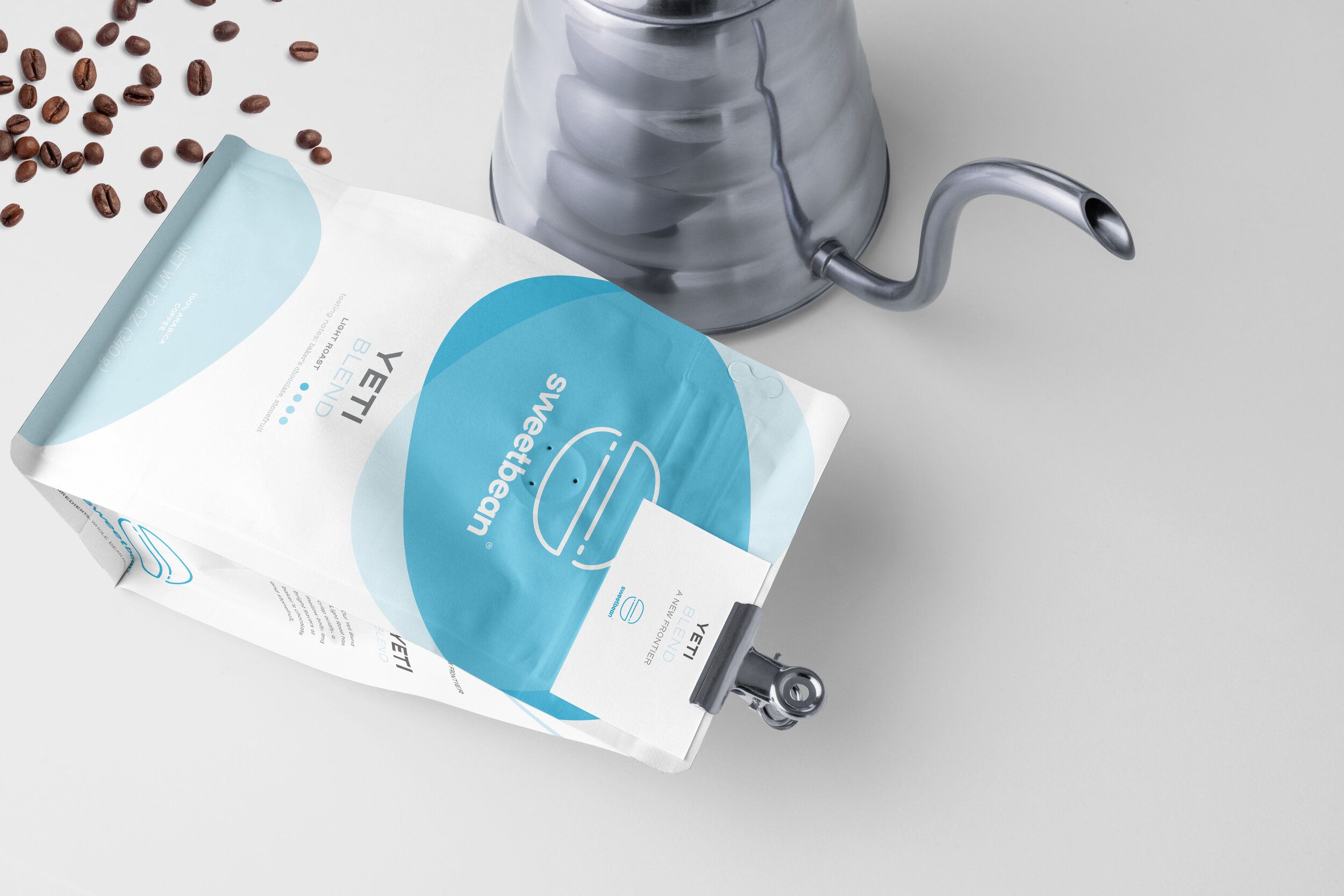
whether it’s light, medium, or dark roast — we have some sweet options.
sweetbean packaging is simple, attractive, and clean making all hte information that matters stand out. Not only that, but the blue hues will be striking on store shelves. The color of each package design matches the roast level (ie light colors for light roast and darker colors for dark roast)