SLAY

Logomark Update,
Programming Templates,
Show Conceptualization
Adjusted for improved balance and symmetry, the new SLAY logomark uses the baseline of the “L” to establish a consistent horizontal sightline – creating a more harmonious relationship between the “A” and the rest of the letters. The “.”(period) has also been adjusted.

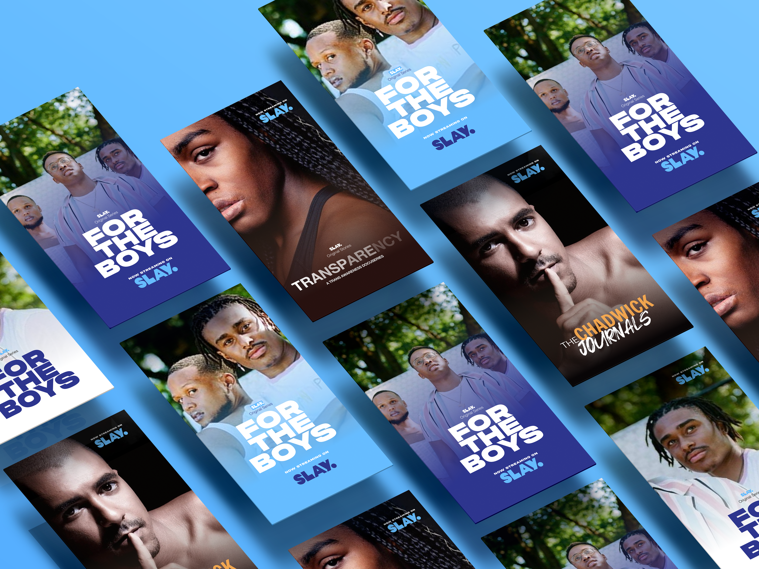
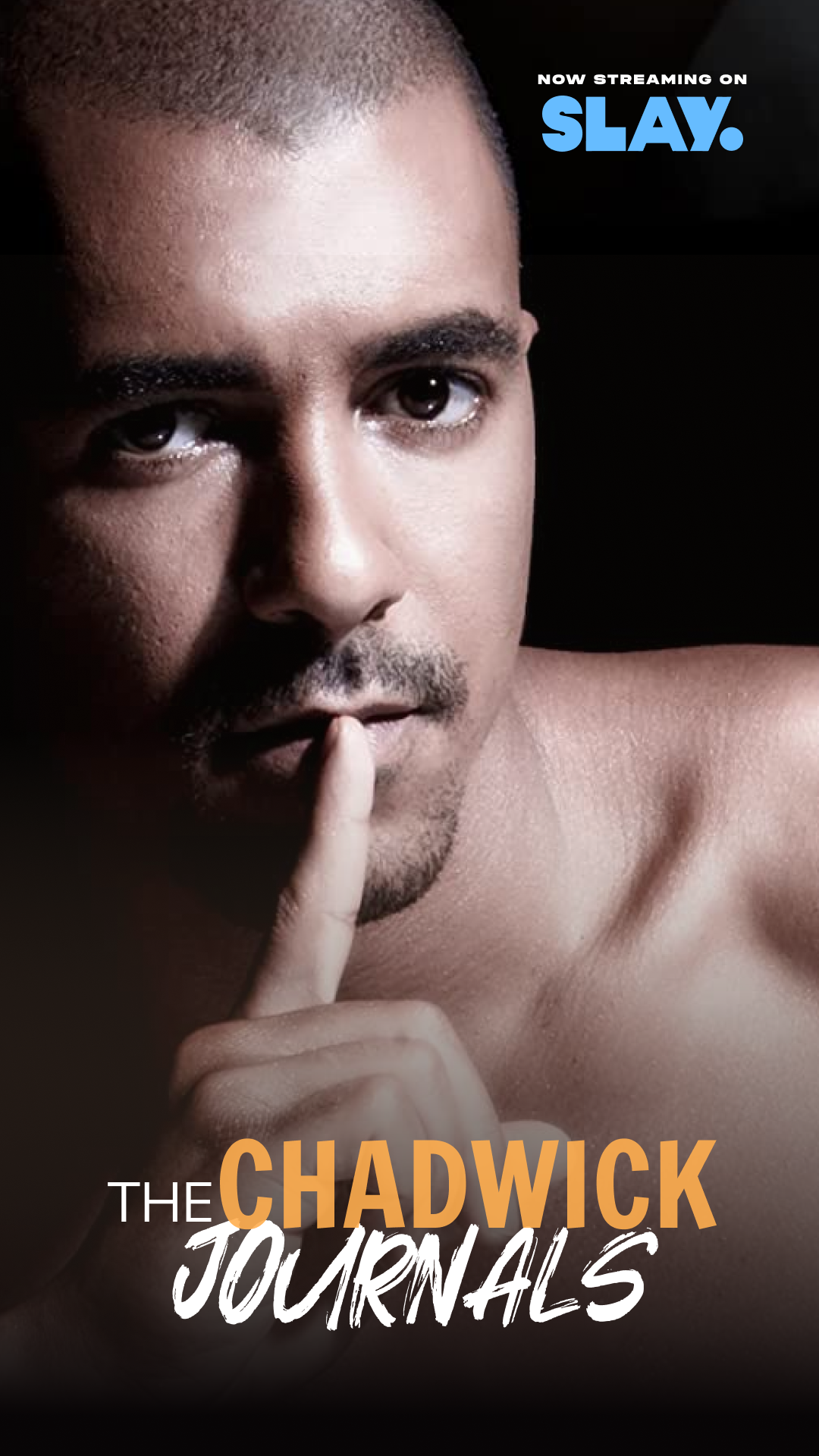
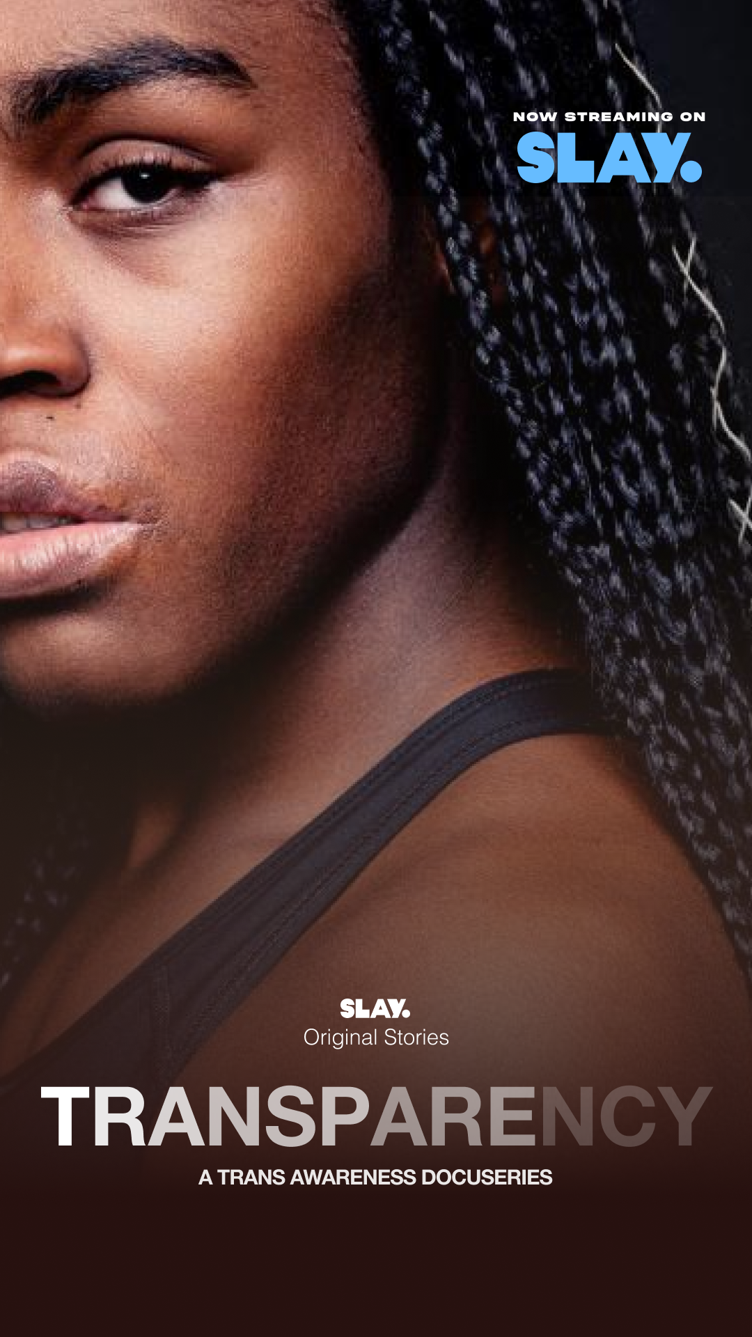
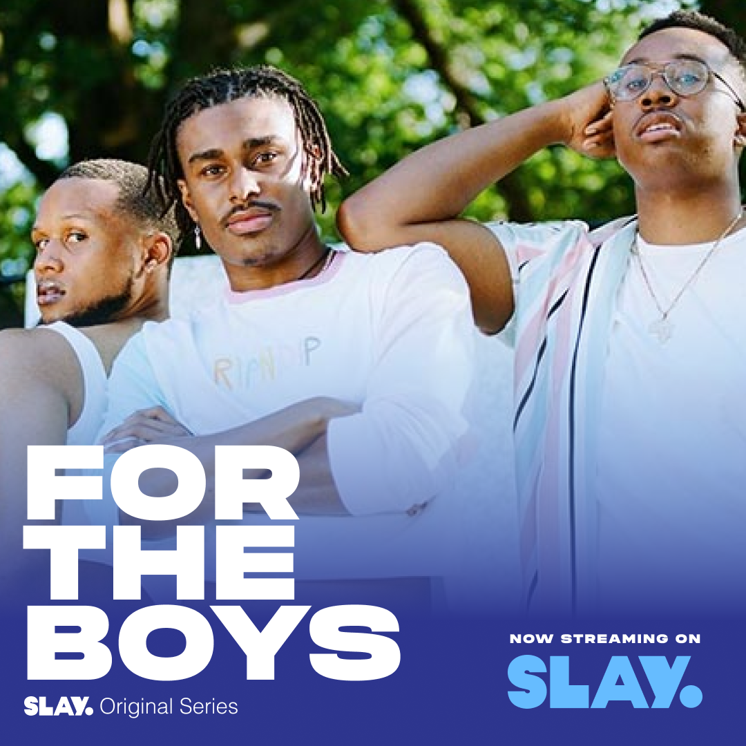
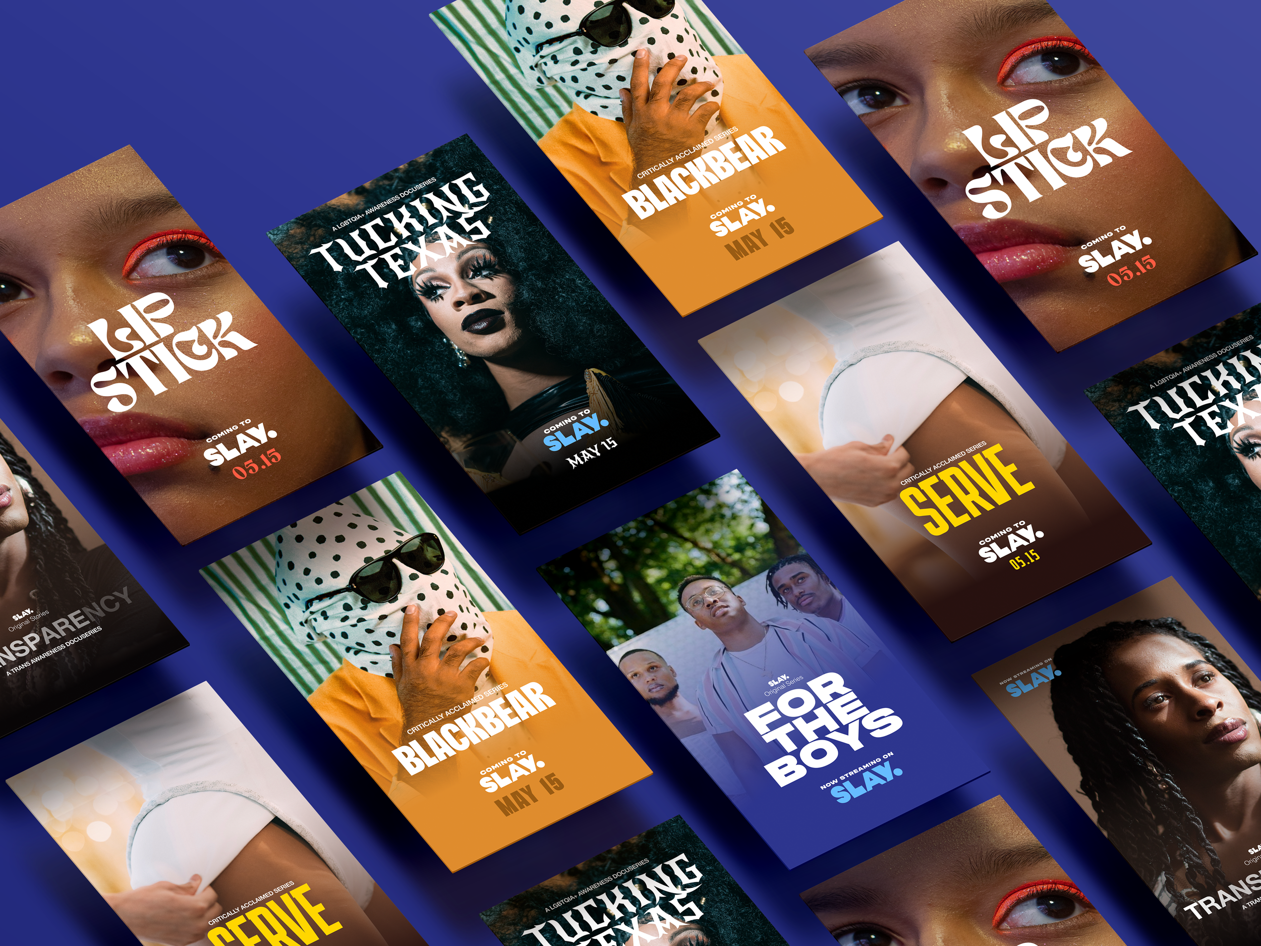
I created a template for all SLAY programming to establish a consistent visual language for all shows. Branding for “For the Boys” and “Chadwick Journals” shows an example of updated branding for an existing show, while other assets (“Tucking Texas”, “Blackbear”, “SERVE”, “LIPSTICK” etc.) are concepts I created.